In the realm of colourimetry, some form of chromaticity diagram is a convenient tool to see and understand what coordinates in a given colour space mean and how they relate to each other. Colour is inherently three-dimensional, but by transforming the space such that one of those dimensions represents luminance, it can be reduced to a two-dimensional space of “chromaticity” that can be readily represented.
By far the most common chromaticity diagrams represent the x and y axes of the CIE 1931 xyY space, a simple transformation of CIE XYZ that preserves the ratios between primaries and isolates luminance to a single axis that can be ignored for the purposes of chromaticity. The reason this particular space is so abundant is that CIE XYZ is well-defined from physical phenomena, and forms the basis of almost every other space.
Most (if not all) of these diagrams will plot x and y on perpendicular axes without mentioning z at all, since it is effectively redundant and calculated by 1−x−y. However, as a ratio of three values, I think there’s value in emphasising the effect of z rather than relegating it to the unlabelled origin, and placing the points of 100% X, Y, and Z equidistant from each other to form an equilateral triangle – even if this is less immediately useful when given a particular pair of xy coordinates. The resulting shape is less skewed and okay I’ll just get on with it:
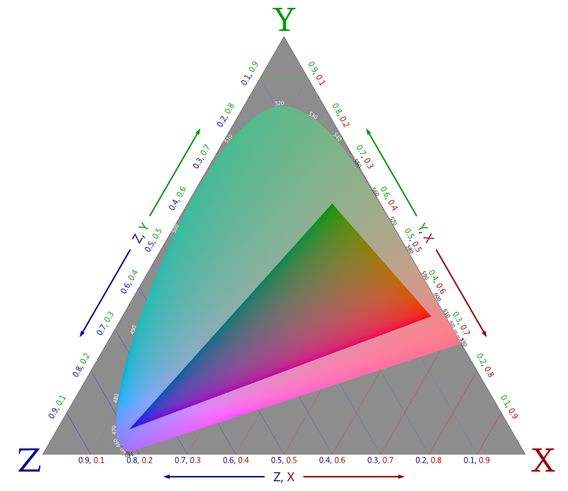
So what does everything here mean? First and foremost the big triangle is the entire range (“gamut”) of chromaticities within the XYZ colour space. Again, luminance is absent; any given chromaticity could be imperceptibly dark or retina-searingly bright. The red, green, and blue lines represent equal proportions of X, Y, and Z respectively. For example, every chromaticity comprised of 30% Y is along a horizontal line 30% up from the bottom edge, and 60% X is 60% of the way from the Y-Z edge to the X corner. It reads exactly like a standard xy diagram that has been scaled down vertically to 87% and skewed 30° right.
Each corner represents “light” that is entirely comprised of the labelled XYZ primary, with an equal amount of all three in the middle. I say “light” because these primaries would somehow require a negative amount of light – they’re not just “invisible”; they literally do not exist. However, these imaginary colours can be mathematically “mixed” to yield the entire range of real colours, shown by the tongue-shaped area in the middle.
The curved boundary of this shape is the spectral locus – every colour produced by a single wavelength of light. Of note is that no mixture of real colours can ever perfectly replicate something on this boundary (though it can get imperceptibly similar along the straighter sections). Every monochromatic light is unique. As a result, whatever display you’re looking at can’t correctly produce them, so this region has been uniformly desaturated as to be correct relative to the grey behind it.
Your display can produce real colours though, which the inner triangle approximates. More accurately, this is the full range of chromaticities that can be encoded by the sRGB colour space of the image, which is mostly what typical displays can represent too. Thus this triangle is the only part of the diagram drawn with the actual chromaticities it refers to. Again, luminance is ignored, so for instance, the grey part equally refers to white and black alike.
I feel inclined to point out that the rendering above is one of the most accurate CIE chromaticity diagrams you’ll find. Others will neglect sRGB gamma which leads to problems all round, or do weird things with brightness to produce misleading artefacts around the middle. They also desaturate (or worse, clamp) out-of-gamut colours by a varying amount, leading to “rays” of a single colour emanating from the centre. Don’t fret if this means little to you; the point is that I’m right and everybody else is wrong, obviously.
No comments found.