Where “alternate” pretty unambiguously means “better,” but I couldn’t pass up the alliteration.
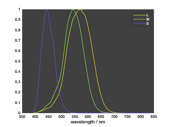
Previously I’ve shown how human cone cells certainly do not peak at red, green and blue frequencies. But those colours are only associated with the peaks; what would it mean to depict the entire range of responses as a single colour?
The approach used here is to treat the relative spectral sensitivities of each receptor as a visible spectral distribution. You could consider it a sum of all detected frequencies weighted by responsivity.
The result seems analogous to a redshift of sorts – it looks like L went from yellow-green to yellow; M went from blue-green to green; S went from purple to slightly-less-purple.
What is certainly true is that far less desaturation was needed to fit these within the sRGB gamut. In fact M, which had needed the most before, now needed none. I still desaturated everything uniformly though, with XYZ (0.05, 0.05, 0.05).
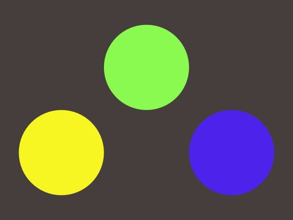
| L | M | S | background | |
| sRGB | 247, 245, 34 | 138, 249, 80 | 77, 35, 236 | 69, 62, 60 |
| CSS value | #f7f522 | #8af950 | #4d23ec | #453e3c |
What does it mean in practice? Rather than representing cones with red, green and blue colours, you might consider something approximating the ones above. It doesn’t have to be exact, you could easily disregard the background, this is more for the purpose of illustration rather than reliably reproducing the resulting colours.
So a plot of cone fundamentals could be done as such:
Hopefully using a purple with more contrast.
The cone fundamentals for this exercise were the Stockman and Sharpe (2000) 2-degree fundamentals based on the Stiles & Burch (1959) 10-degree CMFs, sourced from http://www.cvrl.org/cones.htm
No comments found.