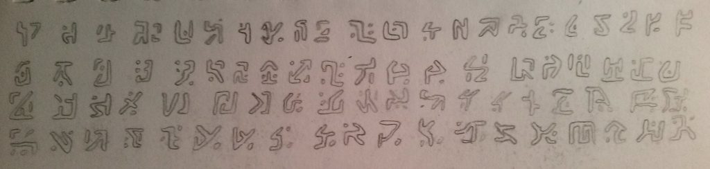
At the beginning of this year, I drew up a set of 80 blocky glyphs.
And since I’m making a transition into digital media as opposed to loose graphite on paper, it seemed appropriate to construct a simple font that included them. Then I could mash my keyboard and get some nice-looking text.
There are a fair few font editors floating around out there. Many are free, browser-based tools with varying usefulness: a lot were based on individual pixels or simple shapes, ensuring the product wouldn’t scale nicely at all; others involved uploading a set of SVGs created elsewhere and converting them into a font, which seemed targeted towards icon fonts for websites. None of this seemed quite appropriate for proper font creation, so I looked into proper desktop software.
And wow are desktop font editors prohibitively expensive. Not content with even one or two hundred dollars, these programs regularly sell for over half a thousand dollars. Many are exclusive to Mac OSX too. One particular program which was more reasonably priced, TypeTool 3, appears to be fairly outdated and yet still charges $50.
Either way, I wasn’t spending that kind of money for a silly set of characters. But fortunately, I managed to find a free, quality font editor that works with proper Bezier curves rather than pixels. It’s called FontForge and appears to have been developed since at least 2003.
It looks like it has some fairly advanced features, but for my purposes I was more interested in just learning how to draw the glyphs and export a font. I might make a basic font in the future though as I have a slight interest in typography (add that to the 100-line to-do list…).
In the end I picked and chose 26 designs and assigned each one to a capital letter as that achieves the desired keyboard-spam effect. I am very happy with the results.

No comments found.